Note: I wrote the first version of this post in 2014 but never got around to finish it. I’ve tried to update all relevant information while writing the last part today in 2016.
The object-fit CSS property is a cool feature that lets you style the “content” of replaced elements (images, videos) in a way that is similar to the keyword values in background-size (most importantly cover and contain). There is also an object-position property that works almost like, you guessed it, background-position.
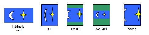
object-fit overview from the specUse cases for object-fit
I’m psyched about these two properties, which are supported everywhere but IE and Edge. They would have been very handy for my full page video background technique, for instance.
I’m also working on the CSS code of an image gallery module, and I’d like to use object-fit for two things:
- Allow users to display an image as covering the whole gallery’s container (which could span the whole viewport), with
object-fit: cover. - Use
object-fit: containin order to fit the image inside a container (small, big or full-size), without making any assumptions about the image’s aspect ratio or the container’s aspect ratio. Using[max-]widthand/or[max-]heightdoesn’t work here, believe me.
So yeah we really want object-fit here. Since it has limited support today, I’m making my own polyfill with background-size. All is well.
What about borders and decorations?
But what if we want to add a border to our images? That’s a common use case, but once you use object-fit it gets complicated. You can style the <img> element, but you can’t style the actually painted graphic in any way (other than fit and position): no box-shadow, no border (and no border-radius), no outline.
So this CSS code:
img {
  width: 300px;
  height: 300px;
  object-fit: contain;
  border: solid 1px rgba(0,0,0,.3);
  box-shadow: 0 0 10px rgba(0,0,0,.3);
}
Will give you this result (see in Firefox, Chrome or Safari):

Which is no good. We want the border or outline to follow the actual image, not the element’s boundary. Is there a way to do that?
Using CSS filters
I looked at CSS Filter Effects (spec, Can I Use?) for a possible solution. There is no built-in effect for borders, but there is one for shadows.
img {
  width: 300px;
  height: 300px;
  object-fit: contain;
  filter: drop-shadow(0px 0px 1px rgba(0,0,0,.3))
        drop-shadow(0px 0px 10px rgba(0,0,0,.3));
}
We’re using a first filter to imitate a 1px border (but the result is a bit different), and another one for the more diffuse shadow. It works alright in Firefox, Chrome and Safari, and should work in Edge too:
This technique has some limitations:
- There is no spread radius for
drop-shadow(). Many border-like effects are thus impossible. - It will paint a shadow under any opaque part of the
<img>element. This includes backgrounds, but also borders. - Faking a solid border is possible but verbose, and limited to opaque colors.
Tricks with multiple shadows
Using four shadows, we can fake a solid border:
img {
  width: 300px;
  height: 300px;
  object-fit: contain;
  filter:
  /* Each shadow becomes part of the image and the next filter
     adds a shadow beneath it, so we have to be very careful. */
    drop-shadow(0 -5px 0 gray)
    drop-shadow(0 5px 0 gray)
    drop-shadow(-5px 0 0 gray)
    drop-shadow(5px 0 0 gray);
}
It works to some extent, but it’s starting to get really verbose, and we can’t use a non-opaque color because the shadows are painted on top of each other.
If we do try to use a RGBA color, things get ugly:
Using SVG filters
Still using the CSS filter property, we can reference a SVG filter to add a border-like effect to the resulting graphic. SVG filters can be really powerful, but the downside is that they’re complex to write and you have to hardcode all your effect’s details (color, opacity, size…) in the SVG code.
We also lose Edge support (as of early 2016), since it supports filter with CSS filter functions but not with SVG filters.
img {
  width: 300px;
  height: 300px;
  object-fit: contain;
  filter: url("filters.svg#inset-outline-1");
}
See the result in Firefox:
Why Firefox only? Well Chrome and Safari both support the filter property and SVG filters, but there were some bugs:
- Chrome and Safari require the SVG file to be in the page (
filter: url(#my-filter)). Chrome ignore filters in a separate file, and Safari turns all the image’s pixels black. - Even with the SVG filters in the page, some dimensions were off in Safari.
- In Chrome on OSX, the filters worked but caused the whole page to be rendered in a tiled fashion, with tiles appearing and disappearing on scrolling.
That’s not a very convincing result, at least with current support. Anyway, let’s describe what we can theoretically do (and see the rest of this demo in Firefox).
Here we use a rather subtle effect that adds 1px black outline at 50% opacity on top of the the image (inside the image, rather than outside). It’s similar to:
img {
  outline: solid 1px rgba(0,0,0,.5);
  outline-offset: -1px;
}
But the necessary SVG code to achieve it is a bit complex and verbose:
<svg xmlns="http://www.w3.org/2000/svg">
  <filter id="inset-outline-1">
    <feFlood flood-color="black" flood-opacity=".5" result="color"/>
    <feColorMatrix in="SourceGraphic" result="mask1" type="matrix" values="0 0 0 0,0 0 0 0,0 0 0 0,0 0 0 0,0 0 1 0"/>
    <feMorphology in="mask1" result="mask2" operator="erode" radius="1"/>
    <feComposite in="color" in2="mask1" operator="in" result="inner"/>
    <feComposite in="inner" in2="mask2" operator="out" result="outline"/>
    <feBlend in="outline" in2="SourceGraphic" mode="normal"/>
  </filter>
</svg>
And if we want to change the effect a little bit, we have to write a completely different filter and use it from the CSS:
img {
  width: 300px;
  height: 300px;
  object-fit: contain;
  filter: url("filters.svg#inset-outline-20");
}
It’s the same SVG filter, with just 2 values changed, but we had to declare it separately. Most importantly, we cannot control the effect from the CSS.
I’ll close this article with a combination of the outline and shadow effects:
img {
  width: 300px;
  height: 300px;
  object-fit: contain;
  filter: url("filters.svg#inset-outline-1")
    drop-shadow(0px 0px 10px rgba(0,0,0,.3));
}
There are probably a lot of decorations possible with SVG filters, but beyond browser compatibility the main downside is that it cannot be tweaked on the CSS side, and understanding how SVG filters work and writing your own filters is no small task.