I wanted to implement a full-page video background:
- with HTML5’s
<video>element - taking up all of the viewport
- and covering the viewport (no black bars)
In order to fully cover the viewport with the video, I reckoned I would have to use JavaScript, measure the viewport, then size and position the video accordingly.
Turns out there are full CSS solutions, at least for the use case above. Here’s one such solution, wrapped in an iframe (note that the video is jerky because it’s a stop motion video—not because of any performance issue). Scroll to see the explanations below.
Letterboxing by default
Taking a <video> element and making it cover the viewport is as easy as with any HTML element, for instance with a fixed position:
#myvid {
  position: fixed;
  top: 0;
  right: 0;
  bottom: 0;
  left: 0;
}
This does make our video element take the viewport’s width and height. But if our video source has an aspect ratio that is different from the video element’s aspect ratio (and that will almost certainly be the case if we just use the viewport’s width and height!), we end up with letterboxing, aka black bars:
<video> element
Let’s note first that letterboxing is very similar to the “contain” value of the background-size property. Actually if our <video> element was a regular <div> and the displayed video was a background image, the browser’s default behavior would be similar to this:
video {
  background-color: black;
  background-image: /* our video */;
  background-position: center center;
  background-size: contain;
}
Now if you’re used to the background-size property, you know that it has a “cover” value which yields exactly the kind of effect that we’re trying to achieve here. If only we could use the same kind of thing for content images and videos!
Well, we can, with object-fit! Alas, there’s a catch.
Using object-fit
In browsers that support the object-fit CSS property, we could fix this easily:
#myvid {
  /* Same code as before, then… */
  object-fit: cover;
}
The object-fit feature was designed for all visual media elements, including images and videos. It lets you tell browsers how they should fit one rectangle (the media source) into another rectangle (the media element). In particular, it has cover and contain values which work much like the similar values of background-size. There’s also an object-position property which is similar to background-position, except it defaults to centering everything (object-position: 50% 50%).
So, object-fit does everything we want, but… it’s only supported on the latest versions of Chrome (see Can I Use’s support table). A quick note on support past and future:
- First implemented by Opera (before they abandoned their own rendering engine)
- Recently added to Chrome (in Chrome 32)
- In the 2012 Candidate Recommendation and the 2013 Editor’s Draft, the feature is labelled “at risk”, though support in Chrome might convince the W3C to keep it.
- Support in Firefox would be good too, so you should vote for this bug.
Anyway, this won’t work for our needs right now, so let’s find a workable CSS solution.
Using Media Queries
How does the video centering work anyway? There are two situations: the video might need to overflow vertically, or it might need to overflow horizontally (never both, that would just be a waste).
A picture might help:
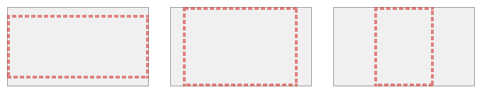
If the viewport’s aspect ratio is bigger than the video’s aspect ratio, the video will overflow on the top and bottom (first example). If the viewport’s aspect ratio is smaller, the video will overflow on the left and right.
Providing we already know the video’s aspect ratio, we can code this in CSS. Note that we will need to hard-code the video’s aspect ratio in the media queries:
#myvid {
  position: fixed;
  top: 0;
  left: 0;
}
@media (min-aspect-ratio: 16/9) {
  #myvid {
    width: 100%;
    height: auto; /* actually taller than viewport */
  }
}
@media (max-aspect-ratio: 16/9) {
  #myvid {
    width: auto; /* actually wider than viewport */
    height: 100%;
  }
}
With this, we have the right, fully-responsive dimensions for our video, whatever the viewport’s dimensions. But it’s still not centered.
Centering trick
We could try to center the video using negative top (or margin-top) or left (or margin-left) values, but getting the right number of pixels to offset the video by is not easy. I acutally tried using calc() and the viewport units, it worked in Firefox and failed in Chrome and Safari, and overall it looked really arcane. Not a good solution!
So how do we center stuff that is wider or taller than the viewport, if we don’t know its exact dimensions? Easy! We make a big-ass container that is both bigger than the video and bigger than the viewport.
Here’s the rough idea in a picture:
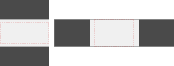
The dashed outline is still our viewport, the light rectangle our video, and the dark area represents our big-ass container. We can then use any CSS centering technique of our choice (say, Flexbox) to center the video inside the container.
But guess what works like a container that automatically centers a video? The <video> element! So we can skip creating a <div> and using CSS centering techniques! Now we just need to make our video element way too tall or way too wide and let the browser handle the centering automatically and by default (it acts a bit like a <div> with a background-size:contain background image).
#myvid {
  position: fixed;
  top: 0;
  left: 0;
  width: 100%;
  height: 100%;
}
@media (min-aspect-ratio: 16/9) {
  #myvid {
    height: 300%; top: -100%;
    /* or height: 200%; top: -50%;
       or height: 400%; top: -150%; */
  }
}
@media (max-aspect-ratio: 16/9) {
  #myvid {
    width: 300%; left: -100%;
    /* or width: 200%; left: -50%;
       or width: 400%; left: -150%; */
  }
}
This will work nicely. But I would also recommend using a container <div> to wrap the video, and giving that container the dimensions of the viewport (dashed outline). Why, you ask? Because if you want to add scripted buttons along with your video, or any other metadata or content that you want to display on top of the video when it’s playing, it’s going to prove useful. So let’s use a slightly more verbose configuration:
<div id="video-bg">
  <video controls>
    <!-- Default video source: -->
    <source type="video/mp4" src="myvid.mp4"
            media="(orientation:landscape)">
    <source type="video/webm" src="https://fvsch.com/articles/video-background/myvid.webm"
            media="(orientation:landscape)">
    <!-- Use square video source to waste less bandwidth: -->
    <source type="video/mp4" src="myvid_square.mp4"
            media="(orientation:portrait)">
    <source type="video/webm" src="myvid_square.webm"
            media="(orientation:portrait)">
  </video>
  <!--
    Buttons or metadata go here
  -->
</div>
In this example I suggest that you could use a different video source for portrait orientation. Of course you might want to not use this kind of full-page video display or video background at all on smaller screens and/or in portrait orientation.
I’m not going to detail these use cases and solutions but you will need to adapt the media queries—and possibly your JavaScript initialization code—accordingly.
Let’s add object-fit anyway
Though this technique is rather nice, object-fit is actually more reliable (especially for very tall or very wide viewports). It might also perform better in Chrome, or in browsers in the future; since it’s made for this kind of thing, browser developers might optimize for it, and not for our slightly hackish technique.
Since we’re planning for the future, and also targetting recent Chrome releases, we can use the @supports CSS rule to detect object-fit support and override some styles.
#video-bg {
  position: fixed;
  top: 0; right: 0; bottom: 0; left: 0;
  overflow: hidden;
}
#video-bg > video {
  position: absolute;
  top: 0;
  left: 0;
  width: 100%;
  height: 100%;
}
/* 1. No object-fit support: */
@media (min-aspect-ratio: 16/9) {
  #video-bg > video { height: 300%; top: -100%; }
}
@media (max-aspect-ratio: 16/9) {
  #video-bg > video { width: 300%; left: -100%; }
}
/* 2. If supporting object-fit, overriding (1): */
@supports (object-fit: cover) {
  #video-bg > video {
    top: 0; left: 0;
    width: 100%; height: 100%;
    object-fit: cover;
  }
}
And… It’s a wrap! You may want to look at the example page, and resize your browser’s window while the video plays. If you try it with Firefox/Safari/IE and with Chrome, you might notice that the 300% dimension is not enough to cope well with extremely narrow viewports (in Firefox/Safari/IE), while object-fit:cover in Chrome works even in those cases.