I came across a discussion of pedestrian crossing buttons today and I find it really interesting from a usability and user experience point of view, so I wanted to share a few thoughts.
Not placebo
You’ve probably heard this urban myth about pedestrian crossing buttons: that they do absolutely nothing, and are just there to give people the illusion of control. And like many enduring myths, while it’s mostly false, there is also some truth to it. You should read this fascinating BBC News piece: Does pressing the pedestrian crossing button actually do anything?
As a side note, I found out about the BBC News piece through this article on a UX blog: Idiot Buttons: The Placebo in UX Design.
This article opens with the pedestrian crossing buttons example, then goes on claiming that most of the time such buttons do nothing. And yet, the source they give for this claim actually disproves it! Quoting from that piece:
At a standalone pedestrian crossing, unconnected to a junction, the button will turn a traffic light red. At a junction it is more complicated.
(…)
Edinburgh has roughly 300 traffic junctions of which about 50-60 are junctions where the green man comes on automatically. (…) At night this might change but during busy times the system is automated.
(…)
There are 4,650 pedestrian crossings in London of which about 2,500 are at junctions. At the majority of these junctions the button controls the green man, says Iain Blackmore, Head of Traffic Infrastructure at Transport for London.
So yeah, most of the time the buttons are useful.
My guess is that the author wanted to push the idea of “placebo in UX”, picked a physical world equivalent for their introduction (a common practice in UX vulgarization), then selected a source that they didn’t read closely enough. But let’s go back to the pedestrian crossing buttons.
Complexity
The BBC News article is about UK pedestrian crossings. It discusses topics such as usability, freedom and pedestrian laws, user perceptions, and hints at engineering and design issues.
I recommend that you read it (of course), with your UX goggles on. Some highlights:
Pushing the button might do one of 3 things
So the button is mostly useful. Well, useful is one thing. Predictable and consistent is another. The button’s behavior may be hard to predict for end users, since pressing the button might:
- Activate a pedestrian green light in maybe 10 seconds. (I don’t have numbers and the article doesn’t mention those. “A few seconds” is what I remember from the eight months I spent in Edinburgh.)
- Activate a pedestrian green light when the next programmed cycle comes (otherwise the next cycle will be skipped), which might be in 10 seconds, 40 seconds or even 100 seconds.
- Do nothing. The next pedestrian green light is programmed and will happen anyway.
Inconsistency fueling urban myth
Now this is just me speculating that:
-
Inconsistent behaviors might fuel the confusion that many people report in the article and in the selected comments.
-
Since bad experiences, frustration and disappointment leave a bigger impression that a system that “just works” (when you expect it to work), a minority of “this button does nothing” might be perceived as “most buttons do nothing”.
-
Automated pedestrian lights (buttons do nothing) might be placed at busiest intersections, and thus impact more users than manual lights at less busy intersections.
-
Finally, I suspect users often mistake scenario 2 (button does something, but the result happens a long time after that) for scenario 3 (button does nothing). The longer it takes for the next cycle to come around, the more useless the button feels like.
One box, several contexts
Traffic lights and pedestrian lights and buttons at a junction are one fixed set of equipment. According to the article, when pedestrian lights are automated during the day, they may still work manually during the night.
Which means that even if a button is useless during the day, it can’t be removed because it’s needed during the night.
I’m just guessing but I wouldn’t be surprised if local transport authorities fine-tune the settings of traffic lights. So a light that was fully manual might be switched to automatic-during-the-day, and the other way round. You don’t want to change costly equipment for that.
Is this a problem? Are there solutions?
Obviously there’s quite a bit of misunderstandings, frustration and myths, but the statu quo might be good enough, or even the best solution. Or maybe it could be improved. I certainly have not researched this enough to tell.
Just for fun, here are a few hints at “solutions”:
-
Mode indicator. Since buttons may work in different modes (automatic or manual), the box’s design might show which mode it’s in, and hint at whether the button can be used or not. This can be done with colors, on/off lights or labels, etc. (I’m not sure but I think in Edinburgh when a pedestrian light is automated, the “WAIT” sign on the box is always on, so you know you don’t have to push the button yourself. Obviously this doesn’t seem to be enough to prevent user confusion.)
-
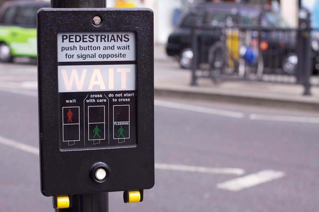
Context-sensitive messages. In digital UI design it’s easy to show a message or instructions only when they make sense. You can show some buttons and labels only when they can be used. In the analog world, it can be trickier. So one flaw of the UK pedestrian crossing button design is that it always says “Pedestrians: push button and wait for signal opposite” (see pic above; even if that label goes off, it can still be read especially in daylight). Ideally, the box would say “Push …” or “Wait”, but never both at the same time.
-
Waiting time indicator. Modern boxes would be able to tell pedestrians how long they have to wait. Now, the problem with this solution is that it might actually increase frustration with long lights, or it might push people to jaywalk and be reckless.
-
Less buttons. Here in France, most pedestrian crossing lights are fully automatic. I’m not 100 percent sure but I’d say all the ones are intersections are automatic, even if it’s a place with very light traffic; so they don’t have a button. Only those in the middle of a road may be manual (with a button). So that’s one solution. But the “pedestrian buttons don’t do squat” myth still exists in France, I’m not sure why.
Bottom line
Pedestrian crossing buttons are a complex topic that can provide a great UX case study. They’re familiar, with quite a bit of hidden complexity. Users have a lot of expectations and believe myths about them.
I’m not formally trained in usability and UX and I don’t know how it’s usually taught, but these buttons sound like great classroom material to me. They can’t be reduced to one concept or talking point.