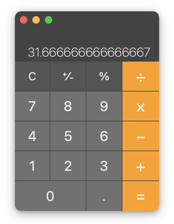
Let’s say you want to calculate 35 × 1.2, and you have a pocket calculator. You whip it out, type on the keys, and the result looks like this:

Hm, maybe? That looks a bit strange. How do you know for sure?
With luck, you know that multiplying 35 by a number higher than 1 should give you a result higher than 35, not lower. Also that fractional part smells fishy. That’s definitely wrong.
You could try again, but your confidence is shaken. Is the calculator broken? Probably not. Will you mess up again?
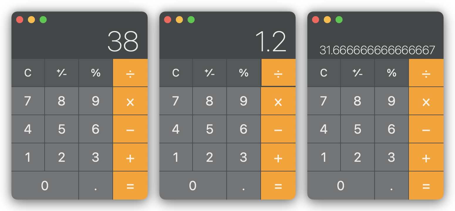
What went wrong? In this case, you made a couple mistakes while inputing the calculation. We can use magic to show you the past:

Here’s what happened: you hit the 8 key instead of the 5 key; and then the ÷ key instead of the × key. You got a result for 38 ÷ 1.2.
To some of us, this is a familiar experience. We’ve lost many points on Math tests because of a momentary lapse of attention, because of finicky calculator keys.
I had a Math teacher who would ban pocket calculators that didn’t show both your input and its result at the same time. If a calculator couldn’t show this:
38 ÷ 1.2
=    31.666666666667
You couldn’t use it. Not in class, not during tests. It’s a recipe for useless mistakes. You need to be able to check your work.
If you give important information to an information system and it disappears as soon as you enter it, you can’t check your work. You can’t catch mistakes.
Some humans have excellent attention and working memory. But we don’t design tools just for the lucky few, do we?
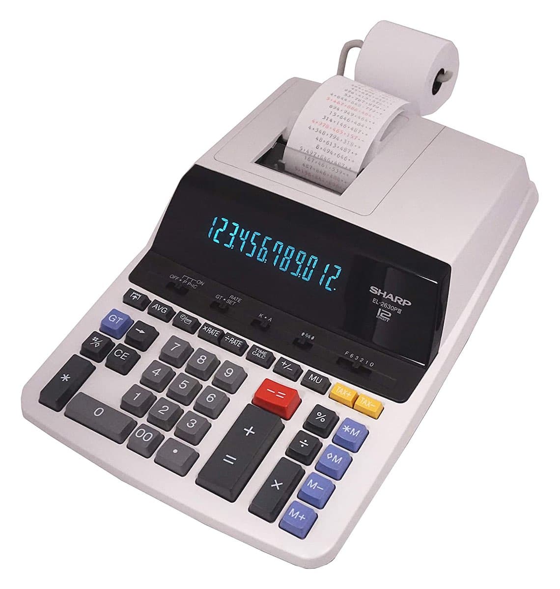
Apple’s Calculator app on macOS imitates an electronic calculator. It uses metaphors from the physical world, such as:
- A display showing a single value at a time.
- Buttons that represent physical keys.
Optionally, if you know the keyboard shortcut or go looking through the menus, you can show a second window called a “Paper Tape”. It shows a log of your calculations and looks like this:

Another well-loved calculator app on macOS is PCalc. It has a single-value display, “keys”, a separate “paper tape” window, themes if you want it to look like a physical calculator, and 3 memory registers like the best HP and Casio machines out there. Its users sing its praises in Mac App Store reviews.
In 2005, an Australian high school student named Nik Youdale built a small calculator app over the summer. It mimicked the look and features of a pocket calculator. His friend, Zac Cohan, was unimpressed:
I couldn’t understand why it only displayed a single number at a time, and why it wouldn’t evaluate an entire mathematical expression like you’d see written out on paper.
Zac wanted more out of a calculator. A few months later, he got another idea. Instead of copying a traditional calculator, they could copy the page of paper where one writes down calculations, results and notes. Zac asked, What if the calculator was actually part of ‘the page’?
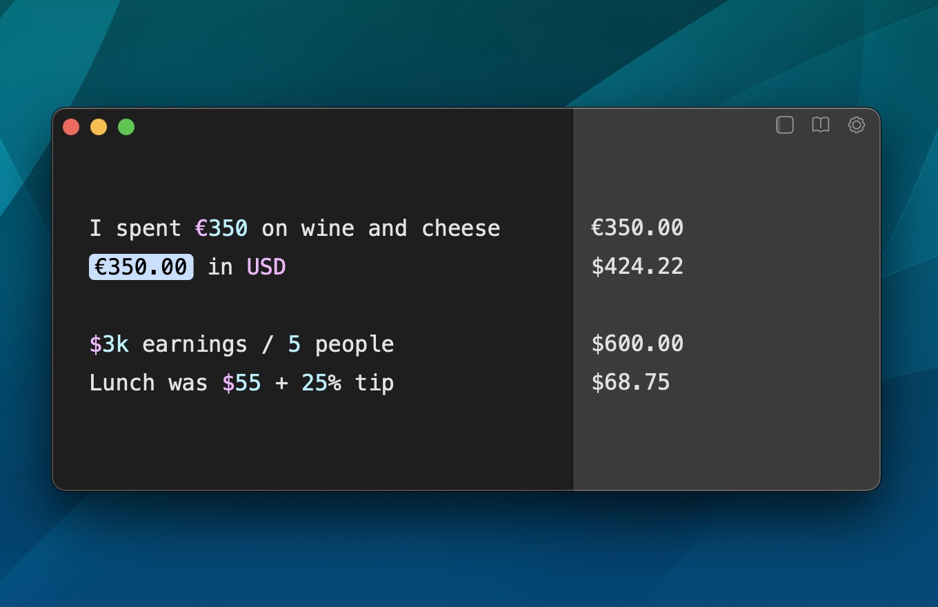
They built an application, Soulver, based on that idea. It’s a paper pad that magically runs your calculations. The current version, Soulver 3, works very much like their first prototype:

Zac also wanted Soulver to be able to understand natural language, or at least to identify numbers, units, and specific commands within text. He has been steadily improving this feature for 15 years, and in my experience it works quite well.
Soulver is my calculator app of choice on macOS. If you want a similar app for Windows, Android or on the Web, the Soulver FAQ lists a few options. Quotes in this section are from Zac Cohan’s article “The creation of soulver”, which is a great read.
“Skeuomorphism”, the persistence of essential features from old objects as ornamental cues, was a hot topic in the design community in the early 2010s. The design of Apple’s iOS 7 was seen as an about-turn, from apps that mimicked paper and leather to a “flat” minimalist look. Skeuomorphism is dead!
But as we’ve seen with Apple’s Calculator, an app’s visual style can be “flat” while faithfully mimicking a physical counterpart.
At the risk of beating a dead horse, I’ll argue that Soulver’s design is “skeumorphic” as well. It reproduces the experience of writing calculations on paper with a pencil, writing down a result, referencing that result later on, etc. Soulver’s first icon showed a couple sheets of paper, a pencil, and a pocket calculator.
Soulver’s design is superior not because it is less of an imitation, but because Zac’s choice of what to imitate was better. He wanted to focus on the paper and pen experience — saying what you want and writing it down to supplement your working memory. The experience of painstakingly hitting keys on a calculator? That could be automated and abstracted away. In an icon update, the pocket calculator was replaced by a digital display, showing results only.
This design may not work for everyone. The happy users of PCalc love how closely it mimicks the electronic calculators of their youth; the more complex the better! Maybe they have above average working memory. Maybe they loathed having to write down every single step of a calculation in school tests. Maybe they just want to use something they already know.
Finally, the popularity of Soulver, PCalc, and even Apple’s Calculator.app is dwarfed by the number one calculator app out there: Excel. Spreadsheets are the main computer calculators that so many workers reach out to.
In a ghastly whisper, the dead horse’s soul asks: are spreadsheets skeuomorphic too?
Probably. They’re designed after accounting ledgers and paper spread-sheets, after all.