A CSS lock is a Responsive Web Design technique that lets you transition smoothly between two values, depending on the current viewport size, rather than jump straight from one value to the other.
This concept was first demonstrated in 2015 by Mike Riethmuller in “Precise control over responsive typography”, and dubbed “CSS locks” by Tim Brown in “Flexible typography with CSS locks”.
I found this technique in Tim’s article and, when I tried wrapping my head around it, and creating variants of it, I had a hard time figuring out what was going on exactly. I did a lot of back-of-the-envelope calculations, and I thought it would be useful to share a mathematical explanation.
I’ll describe the technique, its limitations, and the math that make it work. But don’t worry about the math: it’s basically addition and multiplication, and I’ve broken down the steps as much as possible—also there will be nice graphs.
What’s a CSS lock?
Viewport-relative sizes
On my latest project I had a hero (full-width) banner with a title on top, and only the “desktop” mock-ups with a big font-size. I figured I wanted smaller text for small screens and something in between for medium screens. So why not make the font-size relative to the viewport width?
Early techniques for that looked like:
h1 { font-size: 4vw; /* Boom! Done. */ }This has two downsides:
- the text gets really small on smaller screens (12.8 pixels at 320px) and really big on bigger screens (64px at 1600px);
- it doesn’t follow user preferences for text size.
CSS lock techniques aim to fix the first issue. Great CSS lock techniques will also try to fix the second issue: following user preferences.
The CSS lock concept
A CSS lock is a specific kind of CSS value calculation where:
- there is a minimum value and a maximum value,
- and two breakpoints (usually based on the viewport width),
- and between those breakpoints, the actual value goes linearly from the minimum to the maximum.
On the CSS side, this can look like:
h1 { font-size: 1.25rem; }

@media (min-width: 320px) {
  h1 { font-size: /* magic value from 1.25rem to 2.5rem */; }
}

@media (min-width: 960px) {
  h1 { font-size: 2.5rem; }
}
Our first challenge will be to actually implement the magic value. I’m going to spoil the fun a bit and reveal that it will look like this:
h1 {
  font-size: calc(1.25rem + viewport_relative_value);
}
Where viewport_relative_value can be a single value (e.g. 3vw) or a more complex calculation (also based on the vw unit or another viewport unit).
Limitations
Because they’re based on viewport units, CSS locks have important limitations. They only work for values that are numbers, can use calc(), and can accept pixel dimensions.
Why pixel values? Because viewport units (vw, vh, vmin and vmax) always resolve to a pixel value. For instance if the viewport width is 768px, then 1vw resolves to 7.68px.
(As a side note, there is a small error in Tim Brown’s article, where he writes that a calculation like 100vw - 30em results in a em value. It doesn’t: the browser will see 100vw as a pixel value, and will substract how many pixels 30em happen to be for that element and that property.)
Some examples of things that will not work:
- a CSS lock for the
opacityproperty, becauseopacity: calc(.5+1px)is an error; - a CSS lock for most
transformfunctions (e.g.rotate: one can’t rotate by a pixel value).
Okay, so this pixel restriction looks fairly limiting, but maybe some brave souls will go ahead and identify all the properties and techniques that can make use of CSS locks.
To get the fun started, we’ll look at the font-size and line-height properties, and how we can build CSS locks for these with either pixel-based or em-based breakpoints.
CSS locks with pixel breakpoints
The demos
- CSS calc lock for font-size (rem+px, px MQ)
- CSS calc lock for line-height (em+px, px MQ)
- Combined font-size and line-height lock (px-based)
In the next sub-sections, we’ll explain how we arrived at the CSS code for each example.
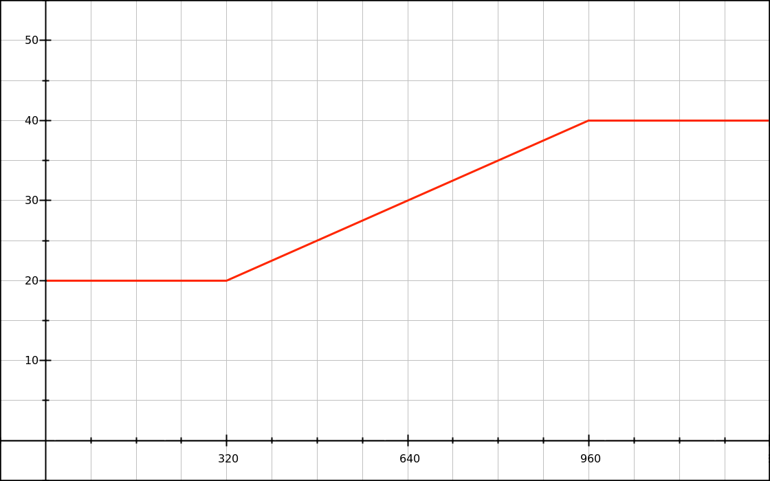
Font size as a linear function
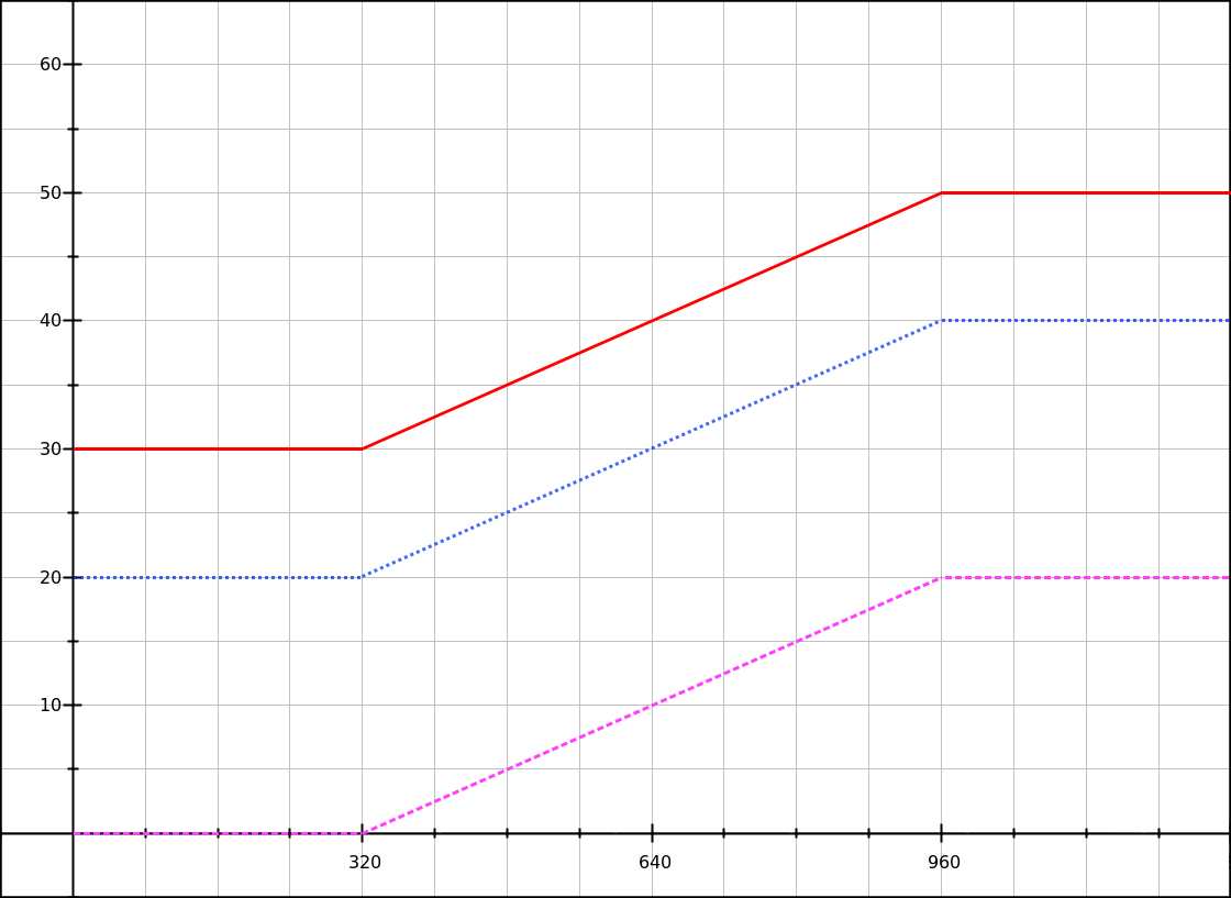
We want the font-size to grow proportionally between two points: 20px at 320px, and 40px at 960px. On a graph, we can write down our two points and draw a line:
What we’re seeing here in red is a simple linear function. We can write it as y = mx + b, where:
yis our font size (vertical axis),xis the viewport width, in pixels (horizontal axis),mis the slope of the function (“how many pixels do we add to the font size for each increase of 1px to the viewport width?”),- and
bis the font-size before we add any viewport-based value.
What we would like to do is figure out the respective values of m and b. They’re the parts of the equation that don’t change.
Let’s find the value of m first. All we need is two (x,y) data points. It’s kind of like working out a speed (distance over time), but here it’s font-size over viewport width:
m = font_size_increase / viewport_increase
m = (y2 - y1) / (x2 - x1)
m = (40 - 20) / (960 - 320)
m = 20 / 640
m = 0.03125
Another way to express this calculation is:
The total increase in font-size is 20px (
40 - 20). The total increase in viewport width is 640px (960 - 320). If the viewport width was growing by just 1px, how big would the increase in font-size be? It would be20 / 640 = 0.03125px.
Now let’s calculate b.
y = mx + b
b = y - mx
b = y - 0.03125x
Since both known points verify our function, we can use the (x,y) values from the first or the second point. Let’s take the first one:
b = y1 - 0.03125 × x1
b = 20 - 0.03125 × 320
b = 10
For the record, we could have found this 10px value just by looking at the graph. But we don’t always have a graph ready. :)
Anyway, our complete linear function is:
y = 0.03125x + 10Translating to CSS
How do we translate our function to CSS syntax? We know that y is the font-size, and that if we want to do basic operations in CSS we need calc().
font-size: calc( 0.03125x + 10px );Not too bad. Of course it’s pseudo-CSS, because x is not valid CSS syntax. But in our linear function, x represents the viewport width, which can be expressed in CSS as 100vw.
font-size: calc( 0.03125 * 100vw + 10px );Now this is working CSS. If we want a shorter style, we can resolve that multiplication. Since 0.03125 × 100 = 3.125:
font-size: calc( 3.125vw + 10px );Of course we want to restrict this style to viewport widths between 320px and 960px. So let’s add some media queries:
h1 { font-size: 20px; }

@media (min-width: 320px) {
  h1 { font-size: calc( 3.125vw + 10px ); }
}

@media (min-width: 960px) {
  h1 { font-size: 40px; }
}
And now our graph looks like the one shown in the introduction.
That’s nice, although I’m not too happy about those pixel values for a font size declaration; can we do better?
Factoring user preferences in
Virtually every web browser lets users ask for smaller or bigger default text. The most common, default value is 16px, but users might change it to anything else (generally to bigger text).
I’d like to introduce this user preference in our formula, and I’m going to use rem values for that purpose. Note that similar principles apply with em or percentage values.
First thing to do is to make sure that the root font-size was not overwritten with an absolute value. For instance, if you’re using Bootstrap 3’s CSS, there’s a bit of code like this:
html {
  font-size: 10px;
}
Do not ever do this! (Thankfully, this will be fixed in Bootstrap 4.) If for any reason you really want to redefine the root em (1rem) value, you could use:
/*
 * Redefine the rem value while keeping it proportional.
 * Useful values, with default font-size of 16px:
 * • 62.5% -> 1rem = 10px, .1rem  = 1px
 * • 125%  -> 1rem = 20px, .05rem = 1px
 */
html {
  font-size: 62.5%;
}
That being said, we’re going to leave the root font-size alone, so that by default it will be equal to 16px. Let’s see what happens if we replace our pixel values with rem values in our font-size lock.
/*
 * With default user settings:
 * • 0.625rem = 10px
 * • 1.25rem  = 20px
 * • 2.5rem   = 40px
 */
h1 { font-size: 1.25rem; }

@media (min-width: 320px) {
  h1 { font-size: calc( 3.125vw + .625rem ); }
}

@media (min-width: 960px) {
  h1 { font-size: 2.5rem; }
}
If we try this code with default browser settings, we can see that it behaves like our previous pixel-based code. Great!
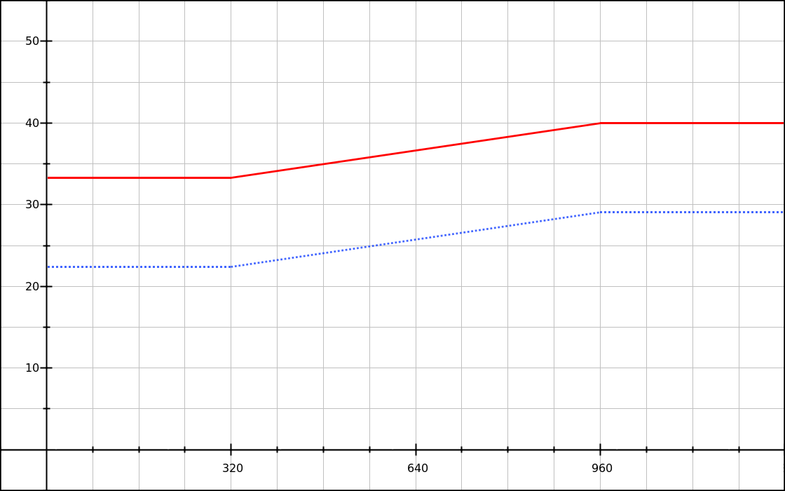
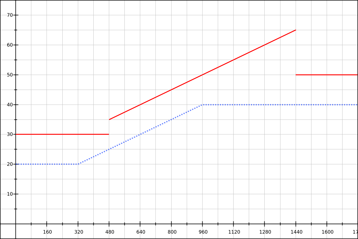
But since we’re doing this to support user changes, we should check how that works too. Say we have a user who configured their browser to use 24px instead of 16px as the default font-size (a 50% increase); how will the above code react? Let’s graph that:
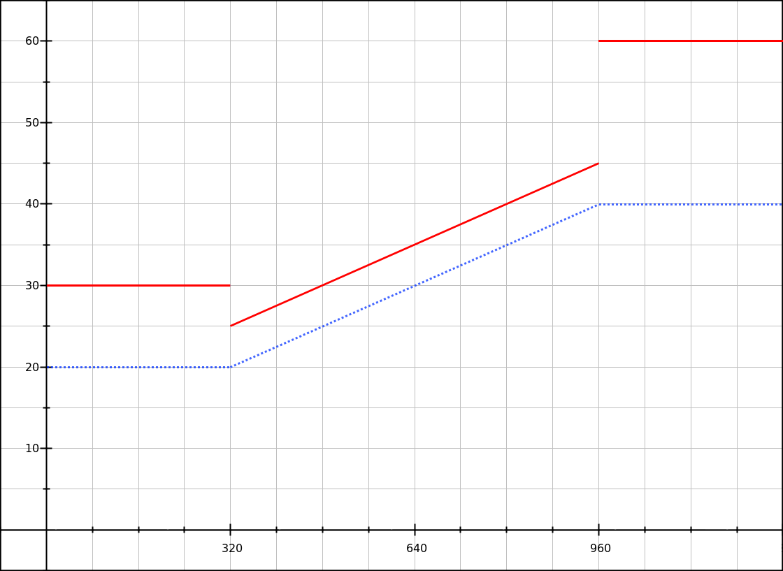
Solid red line: with a base font-size of 24px.
At the 320px breakpoint the font size actually becomes smaller (jumping from 30px to 25px), and there’s a big jump at the higher breakpoint (45px to 60px). Woops.
To fix that, we can use the same user-configurable baseline for all 3 sizes. For instance, we could pick a 1.25rem baseline:
h1 { font-size: 1.25rem; }

@media (min-width: 320px) {
  h1 { font-size: calc( 1.25rem + 3.125vw - 10px ); }
}

@media (min-width: 960px) {
  h1 { font-size: calc( 1.25rem + 20px ); }
}
See the 3.125vw - 10px part? It’s our old linear function (of the form mx + b), but with a different value for b; let’s call it b′. In our case, since we know that our baseline value is equivalent to 20px, we can get the b′ value with a simple substraction:
b′ = b - baseline_value
b′ = 10 - 20
b′ = 10
Another strategy is to pick your baseline value before anything else, then look for the linear function that describes the font-size increase (I’m calling it y′ to differentiate it from the complete font-size y). Let’s try that quickly:
x1 = 320
x2 = 960
y′1 = 0
y′2 = 20
m = (y′2 - y′1) / (x2 - x1)
m = (20 - 0) / (960 - 320)
m = 20 / 640
m = 0.03125
b′ = y′ - mx
b′ = y′1 - 0.03125 × x1
b′ = 0 - 0.03125 × 320
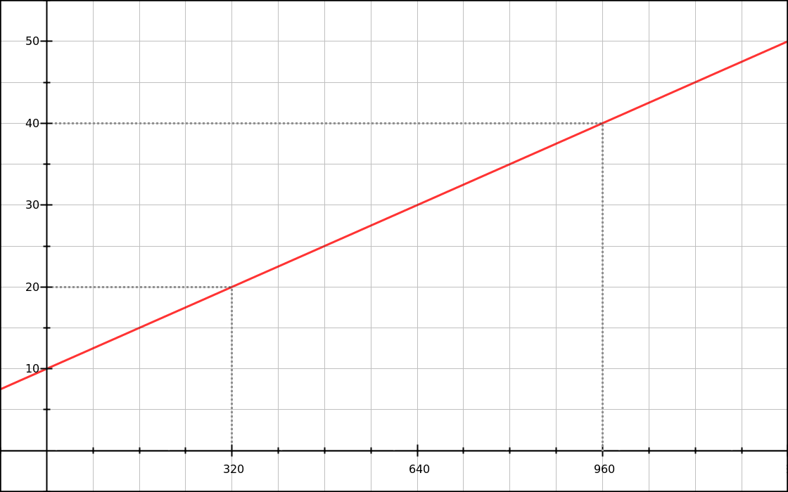
b′ = -10We end up with y′ = 0.03125x - 10, which looks like this:
With our base value in rem and additional sizes in vw and/or px, we finally get a fully working font-size lock. When the user changes their base font-size, the whole thing goes up or down and doesn’t break. Success!
Dotted blue line: with a base font-size of 16px.
Solid red line: with a base font-size of 24px.
Of course it’s not exactly what the user asked for: they wanted 50% bigger fonts, and we gave them a font size that is 50% bigger on smaller viewports, and only 25% bigger on bigger viewports. But it’s a good compromise nonetheless.
Making a line-height lock
For this part, our scenario is going to be: “We want paragraphs with a 1.4 line-height at 320px and a 1.8 line-height at 960px”.
Since we’ll be working with a base value plus a dynamic value expressed in pixels, we need to know how many pixels those 1.4 and 1.8 ratios refer to. Which means we need to know the font-size of our paragraphs. Let’s say that our paragraphs use the default font-size, so probably 16px. Our data points are:
16 * 1.4 = 22.4pixels at the lower breakpoint (320px)16 * 1.8 = 28.8pixels at the higher breakpoint (960px)
We’ll also use 1.4em = 22.4px as our baseline. So what we are looking at here is an increase of 6.4px. We can work out our linear formula, as before:
x1 = 320
x2 = 960

y′1 = 0
y′2 = 6.4

m = (y′2 - y′1) / (x2 - x1)
m = (6.4 - 0) / (960 - 320)
m = 6.4 / 640
m = 0.01

b′ = y′ - mx
b′ = y′1 - 0.01 × x1
b′ = 0 - 0.01 × 320
b′ = 3.2

y′ = 0.01x - 3.2
Transposing to CSS, we get:
line-height: calc( 1.4em + 1vw - 3.2px );Important: our baseline value must be expressed as 1.4em inside of calc() expressions; the unitless ratio (1.4) notation won’t work inside calc() (all browsers), and the percent notation (140%) works in Chrome and Firefox but not in Safari.
Then we add media queries, and make sure that all declarations for the line-height value use the same baseline (1.4em).
p { line-height: 1.4em; }

@media (min-width: 320px) {
  p { line-height: calc( 1.4em + 1vw - 3.2px ); }
}

@media (min-width: 960px) {
  p { line-height: calc( 1.4em + 6.4px ); }
}
Reminder: for the high value, we can’t just use 1.8em, because we need the part that is added to our base to be expressed in pixels. If we used 1.8em (or 1.8 or 180%), the result would be alright for a base font size of 16px but would break when the user changed it.
We can graph our function, and check that it does work with a different base font-size.
Solid red line: with a base font-size of 24px.
Finally, since our line-height formula depends on the element’s own font-size, if we change that font size we have to change the formula. For instance in our line-height demo there is a paragraph with bigger text, defined like this:
.big {
  font-size: 1.66em;
}
This changes our data points:
16 * 1.66 * 1.4 = 37.184pixels at the lower breakpoint (320px)16 * 1.66 * 1.8 = 47.808pixels at the higher breakpoint (960px)
We can run the calculations and get this updated formula: y′ = 0.0166x - 5.312. Then, combining the previous style and this one in our CSS, we get:
p { line-height: 1.4em; }
.big { font-size: 1.66em; }

@media (min-width: 320px) {
  p    { line-height: calc( 1.4em + 1vw - 3.2px ); }
  .big { line-height: calc( 1.4em + 1.66vw - 5.312px ); }
}

@media (min-width: 960px) {
  p    { line-height: calc( 1.4em + 6.4px ); }
  .big { line-height: calc( 1.4em + 10.624px ); }
}
Another option is to let CSS do the calculations. Since we’re using the same breakpoints and relative line-heights as for standard paragraphs, we just need to add a 1.66 factor:
p { line-height: 1.4em; }
.big { font-size: 1.66em; }

@media (min-width: 320px) {
  p    { line-height: calc( 1.4em + 1vw - 3.2px ); }
  .big { line-height: calc( 1.4em + (1vw - 3.2px) * 1.66 ); }
}
@media (min-width: 960px) {
  p    { line-height: calc( 1.4em + 6.4px ); }
  .big { line-height: calc( 1.4em + 6.4px * 1.66 ); }
}
Combining font-size and line-height locks
Okay let’s try to put it all together. Here’s our scenario: we have a fluid column of text with a H1 and a few paragraphs, and we’re going to change the font-size and line-height using the following values:
| Element and property | Value at 320px | Value at 960px |
|---|---|---|
| H1 font-size | 24px | 40px |
| H1 line-height | 1.33em | 1.2em |
| P font-size | 15px | 18px |
| P line-height | 1.5em | 1.66em |
You’ll notice that we’re doing two different things with the line heights. As a general rule, when text becomes bigger we should make the line-height tighter, and when a column becomes wider we should make the line-height more loose. But in our scenario, both principles apply at the same time and contradict each other! So we have to make a prioritize one aspect over the other:
- For the H1, we feel that the font-size increase will be more dramatic than the column width increase.
- For the paragraphs, we feel that the column width increase will be more dramatic than the subtle font-size increase.
Now, let’s pick two breakpoints. I’ll go with 320px and 960px again, yay. Let’s start by writing the font-size locks:
h1 { font-size: 1.5rem; }
/* .9375rem = 15px with default settings */
p { font-size: .9375rem; }

@media (min-width: 320px) {
  h1 { font-size: calc( 1.5rem + 2.5vw - 8px ); }
  /* .46875vw - 1.5px results in a value from 0 to 3px */
  p { font-size: calc( .9375rem + .46875vw - 1.5px ); }
}
@media (min-width: 960px) {
  h1 { font-size: calc(1.5rem + 16px); }
  p { font-size: calc( .9375rem + 3px ); }
}
Nothing new here, except for the different values.
Next, calculating the line-height locks is going to get a bit harder than what we did last time.
Let’s begin with our H1 element. We’d like to use a relative baseline value for the line-height, so we take the lowest value, 1.2em. Since the element’s font size is variable, that 1.2em is going to describe a dynamic and linear value, characterized by two points:
24 × 1.2 = 28.8pxat the lower breakpoint,40 × 1.2 = 48pxat the higher breakpoint.
We also know that at the lower breakpoint, we want the line-height to be 1.33em, which we can round to just 32px.
We would like to find a linear function that describes “what we add to the 1.20em baseline”. If we remove this 1.2em baseline from our data points, we have two modified data points:
24 × (1.3333 - 1.2) = 3.2pxat the lower breakpoint,40 × (1.2 - 1.2) = 0pxat the higher breakpoint.
We should end up with a negative slope. Let’s calculate that.
m = (y′2 - y′1) / (x2 - x1)
m = (0 - 3.2) / (960 - 320)
m = -3.2 / 640
m = -0.005
b′ = y′ - mx
b′ = y′1 - (-0.005 × x1)
b′ = 3.2 + 0.005 × 320
b′ = 4.8
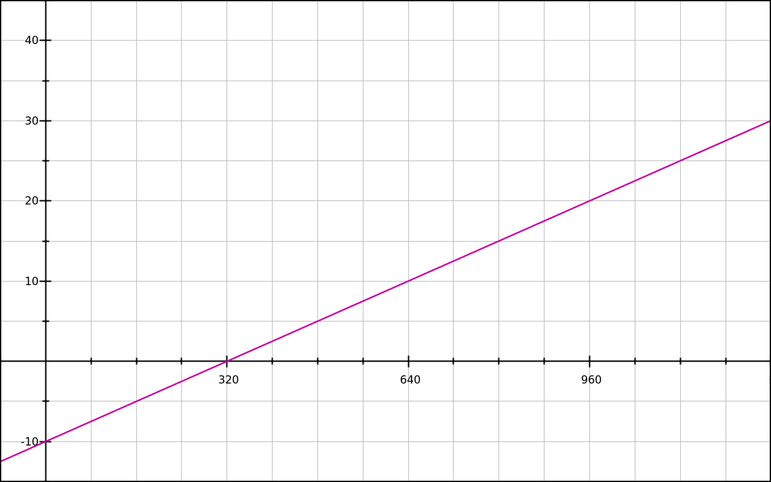
y′ = -0.005x + 4.8Transposed to CSS, we get:
h1 {
  line-height: calc( 1.2em - .5vw + 4.8px );
}
Let’s look at our function on a graph, and see how it relates to the related font-size function.
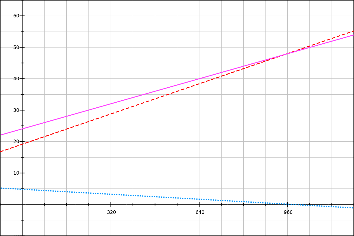
Dashed red line: our line-height baseline (120% of the title’s font-size).
Solid magenta line: the final line-height.
Looking at this graph, we can see that the final line-height (magenta line) is equal to the 120% baseline (red dashes) plus the line-height decrease (blue dots). You can look at these equations on GraphSketch.com and check for yourself.
For the paragraphs, we’re going to use 1.5em as our baseline. The line-height increase we want is: (1.75 - 1.5) × 18 = 4.5px.
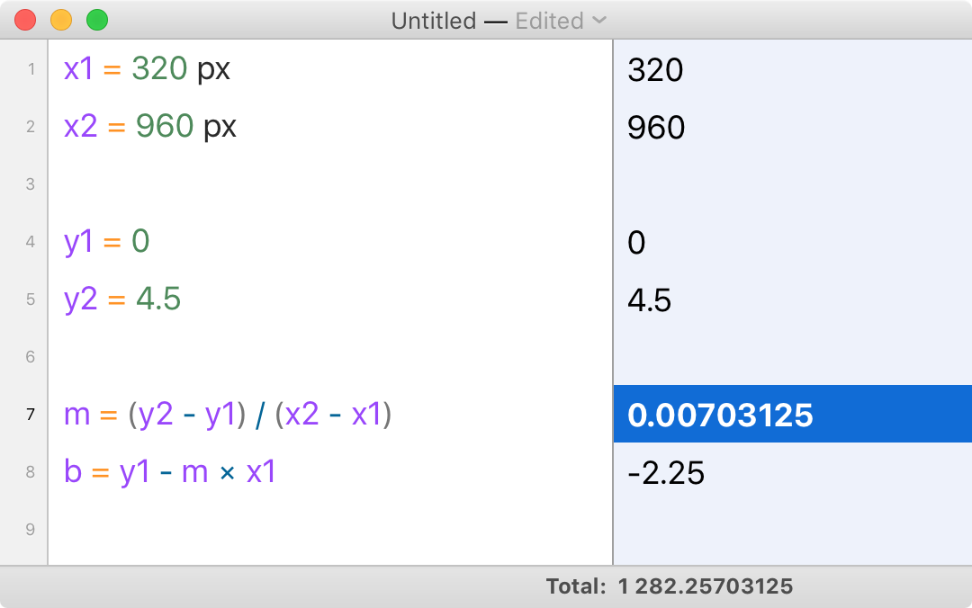
y′ = 0.00703125x - 2.25
To see the complete CSS code, look at the combined font-size plus line-height demo and its source. While resizing the browser’s window, you should see that the effect is subtle but is definitively working.
I also recommend that you test this demo after changing your browser’s base font size. Note that in that situation the exact line-height ratios are slightly different, but they still look alright; and there’s no danger of the line-height becoming smaller than the baseline value.
Automating the calculations
Throughout this part I’ve been doing all the calculations by hand or using a calculator such as Soulver.
But this process can be tedious and error-prone. Could we automate it, to reduce the chance of human error?
Our first option would be to do the whole calculation in CSS. This is a variant of the formula we’ve used in our font-size examples, with all the values spelled out:
@media (min-width: 320px) and (max-width: 959px) {
  h1 {
    font-size: calc(
      /* y1 */
      1.5rem
      /* + m × x */
      + ((40 - 24) / (960 - 320)) * 100vw
      /* - m × x1 */
      - ((40 - 24) / (960 - 320)) * 320px
    );
  }
}
That’s a bit verbose, and can be reduced further to:
@media (min-width: 320px) and (max-width: 959px) {
  h1 {
    font-size: calc( 1.5rem + 16 * (100vw - 320px) / (960 - 320) );
  }
}
This works for a combined font-size and line-height, too, but it might be less intuitive, especially with a negative slope.
@media (min-width: 320px) and (max-width: 959px) {
  h1 {
    font-size: calc( 1.5rem + 16 * (100vw - 320px) / (960 - 320) );
    /* For a negative slope, we have to invert the breakpoints */
    line-height: calc( 1.2em + 3.2 * (100vw - 960px) / (320 - 960) );
  }
}
Our second option would be to automate these calculations with a Sass mixin or a PostCSS plugin. Sadly I don’t have one to offer right now, but if you’re taking a shot at it let me know and I’ll add it to this article.
CSS locks with em breakpoints
The demos, reloaded
I’ve taken our first 3 demos and ported them from px-based breakpoints and value increments to em-based breakpoints and rem-based value increments.
- CSS calc lock for font-size (rem+rem, em MQ)
- CSS calc lock for line-height (em+rem, px MQ)
- Combined font-size and line-height lock (em/rem-based)
In the next sub-sections we’ll describe how the specific syntax used for these demos works.
Don’t use em media queries with m × 100vw
Remember the m × 100vw syntax we used in section II (for instance in code looking like calc(base + 2.5vw))? We can’t use that with em-based media queries.
This is because in the context of a media query, both the em and the rem unit refer to one thing: the User Agent’s base font size. Which is — as we’ve said a few times already in this article — usually 16px, but it might be smaller or bigger depending on two things:
- Browser or OS choices (mostly for special cases like TV browsers, and some e-readers).
- User preference.
This means that if we have two breakpoints at 20em and 60em, the actual CSS widths at which they will match are:
- 320px and 960px for a base font size of 16px,
- 480px and 1440px for a base font size of 24px,
- etc.
(Note that these are CSS pixels, and not device pixels. We’re not concerned with device pixels in this article as they don’t impact our calculations.)
In section II, we had examples looking like this:
font-size: calc( 3.125vw + .625rem );If we take this syntax and replace all breakpoints with em-based breakpoints, by supposing that 1em in a media query is 16px, we could have code like this:
h1 { font-size: 1.25rem; }

/* Don’t do this :((( */
@media (min-width: 20em) {
  h1 { font-size: calc( 1.25rem + 3.125vw - 10px ); }
}

/* Or this. */
@media (min-width: 60em) {
  h1 { font-size: calc( 1.25rem + 20px ); }
}
This would indeed work if the operating system, browser and user never changed the base font size. But if for any reason it was different, mayhem would ensue.
Solid red line: result with a base font size of 24px.
What’s happening here? When we change the base font-size, our em-based breakpoints move to bigger pixel values. Our 3.125vw - 10px value is only true for specific pixel breakpoints, though!
- At 320px,
3.125vw - 10pxis 0px, as planned. - At 480px, on the other hand,
3.125vw - 10pxis 5px.
Things get worse at the higher breakpoint:
- At 960px,
3.125vw - 10pxis 20px, is expected. - At 1440px,
3.125vw - 10pxis 35px (15px too big).
If we want to use em-based breakpoints, we’re going to need a different technique.
Doing the math again
This technique, demonstrated in Mike Riethmuller’s article, relies on letting CSS do much of the calculation, using two variable parts:
100vw, the viewport width;- the lower breakpoint, expressed in
rem.
The formula we’re going to use is:
y = m × (x - x1) / (x2 - x1)
How do we end up with this formula? Let’s retrace our steps a bit. In section II we showed that our font-size or line-height could be described as a linear function:
y = mx + b
In CSS, we can work with x (that’s 100vw). But we can’t resolve m and b to precise px or a vw values, because those are fixed pixel quantities and they would end up mismatched with our em-based breakpoints if the user ever changed the base font size.
So what we want is to see if we can replace m and b with other known values, namely our two data points, (x1,y1) and (x2,y2).
We already showed how to find b from one point in the function:
b = y - mx
b = y1 - m × x1
Putting the two together:
y = mx + b
y = mx + y1 - m × x1
We’ve eliminated b from the equation, yay!
Also, in section II we showed that what we really needed was not the complete font-size or line-height value, but the dynamic part that we add to a baseline value. We called that dynamic part y′, and we can express it as:
y  = y1 + y′
y′ = y - y1
Replacing y with the equation we found just before:
y′ = mx + y1 - m × x1 - y1
y′ = mx + y1 - m × x1 - y1
Hey look, we can eliminate the + y1 - y1 parts!
y′ = m × x - m × x1
y′ = m × (x - x1)
This is going really well. Now, can we replace m with values we actually know? We showed earlier that:
m = (y2 - y1) / (x2 - x1)
So:
y′ = (y2 - y1) / (x2 - x1) × (x - x1)
Which we can also write as:
y′ = max_value_increase × (x - x1) / (x2 - x1)
Translating to CSS
Now that’s a value we can use in CSS. Going back to our 20px-to-40px example, we could write it down as:
@media (min-width: 20em) and (max-width: 60em) {
  h1 {
    /* WARNING: this doesn’t work yet! */
    font-size: calc(
      1.25rem /* baseline value */
      + 20px /* difference between max value and baseline */
      * (100vw - 20rem) /* x - x1 */
      / (60rem - 20rem) /* x2 - x1 */
    );
  }
}
This code doesn’t work yet. It looks like it might work, but calc() in CSS has a number of restrictions when it comes to how you can do multiplications and divisions with the same or with different values.
Let’s start with the 100vw - 20rem fragment; this part works as is, and will return a pixel value.
For instance if the base font-size is 16px and the viewport width is 600px, the result will be 280px (600 - 20 × 15). If the base font-size is 24px and the viewport width is 600px, the result will be 120px (600 - 20 × 24).
Note that is that we’re using the rem unit to express our breakpoints. Why not em, you ask? Because in a CSS value, em will not refer to the base font-size, but instead it refers to the element’s own font-size (generally) or to its parent font-size (when used in the font-size property).
Ideally, we would need a CSS unit that refers to the browser’s base font-size, but this unit doesn’t exist. The closest we have is rem, and it will only refer to that base font-size if it was left completely unchanged.
That means you must make sure you don’t have code like this in your CSS:
/* Bad */
html { font-size: 10px; }

/* Equally bad */
:root { font-size: 16px; }

/* Manageable, but we'll have to write all
   our breakpoints as e.g. 20rem/1.25,
   40em/1.25, etc. */
:root { font-size: 125%; }
Things get a bit more complicated on the other side of the division.
Unitless calc divisors and factors
Ideally, we would like the 60rem - 20rem part to resolve to a pixel width. This would mean that the whole (x - x1) / (x2 - x1) division would resolve to a value between 0 and 1. Let’s call this value n.
For instance, with a base font-size of 16px and a viewport width width of 600px, we would get:
n = (x - x1) / (x2 - x1)
n = (600 - 320) / (960 - 320)
n = 280 / 640
n = 0.475
Sadly, it doesn’t quite work like that.
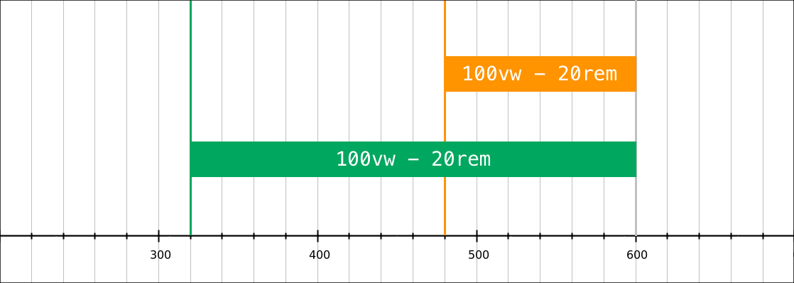
The main reason is that you can’t use pixels, or any CSS unit, for the divisor of a calc() division. (The divisor is the part on the right. Don’t worry if you didn’t remember that from school, I had to look it up.) You can only divide by a unitless value. So what are our options here?
What if we just remove the units in the divisor? What would be the result of calc((100vw - 20rem)/(60 - 20))?
| Viewport width | CSS division | Result |
|---|---|---|
| 20em (320px) | (320px - 16px × 20) / (60 - 20) | = 0px |
| 40em (640px) | (640px - 16px × 20) / (60 - 20) | = 8px |
| 60em (960px) | (960px - 16px × 20) / (60 - 20) | = 16px |
| Viewport width | CSS division | Result |
|---|---|---|
| 20em (480px) | (480px - 24px × 20) / (60 - 20) | = 0px |
| 40em (960px) | (960px - 24px × 20) / (60 - 20) | = 12px |
| 60em (1440px) | (1440px - 24px × 20) / (60 - 20) | = 24px |
As you’ll notice, when we stay within our breakpoints (20em to 60em), we get a value going linearly between 0rem and 1rem. We can use that!
Next up is the 20px factor we had used in our first attempt at making the CSS work. We will need to scratch that.
Our first attempt tried to achieve this kind of code:
font-size: calc( 1.25rem + 20px * n );Where n was meant to be a value between 0 and 1. But because of the syntax restrictions for calc() divisions, we couldn’t get that 0-to-1 result we wanted.
What we did manage to get was a pixel value equivalent to 0rem and 1rem; let’s call this value r.
Another restriction affects calc() multiplications. When writing calc(a * b), either a or b should be a unitless number.
Since r already has a unit (it’s a pixel value), the other factor should be unitless.
In our example, we want a 20px increase at the higher breakpoint. 20px is 1.25rem, so we will use a 1.25 factor:
font-size: calc( 1.25rem + 1.25 * r );This should work well, but note that the r value will change depending on the base font-size.
- With a 16px base,
1.25 * rwill be a value between 0px and 20px. - With a 24px base,
1.25 * rwill be a value between 0px and 30px.
Let’s write the whole CSS lock, with the media queries and the low and high values:
h1 {
  font-size: 1.25rem;
}

@media (min-width: 20em) {
  /* The (100vw - 20rem) / (60 - 20) part
     resolves to 0-1rem, depending on the
     viewport width (between 20em and 60em). */
  h1 {
    font-size: calc( 1.25rem + 1.25 * (100vw - 20rem) / (60 - 20) );
  }
}

@media (min-width: 60em) {
  /* The right part of the addition *must* be a
     rem value. In this example we *could* change
     the whole declaration to font-size:2.5rem,
     but if our basline value was not expressed
     in rem we would have to use calc. */
  h1 {
    font-size: calc( 1.25rem + 1.25 * 1rem );
  }
}
Unlike the px-based font-size lock, this time when the user increases the base font-size by 50% everything gets a 50% increase: the baseline value, the variable part and the breakpoints. We get a 30px–60px range, instead of the default 20px–40px range.
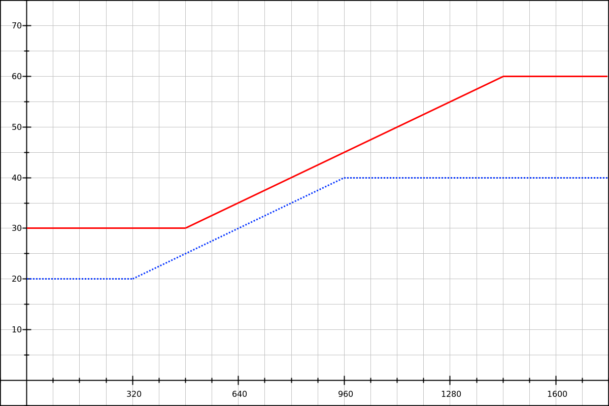
Solid red line: result with a base font size of 24px.
You can check this behavior in our first em-based demo.
Line-height locks with em/rem
In our second demo, we want to change a paragraph’s line-height from 1.4 to 1.8. We’re using 1.4em as our base value, and for the variable part we use the same formula as in the font-size example.
p {
  line-height: 1.4em;
}
@media (min-width: 20em) {
  p {
    line-height: calc( 1.4em + .4 * (100vw - 20rem) / (60 - 20) );
  }
}
@media (min-width: 60em) {
  p {
    line-height: calc( 1.4em + .4 * 1rem );
  }
}
For the variable part of our line-height, we know that we want a rem value, because (100vw - 20rem) / (60 - 20) will result in a pixel value between 0rem and 1rem.
Since our paragraph’s font-size stays at 1rem, the 0.4em line-height increase we’re looking for is equivalent to .4rem. So that’s the value we use in our two calc() expressions.
Now let’s take a line-height example from our third demo. We want the H1’s line-height to decrease from 1.33 to 1.2. We also know that its font-size will change at the same time.
For that same example in section II, we had determined that the line-height decrease could be expressed by two data points:
24 × (1.3333 - 1.2) = 3.2pxat the lower breakpoint,40 × (1.2 - 1.2) = 0pxat the higher breakpoint.
So we’re using a 1.2em base value, and a variable part from 3.2px to 0px. With a base font size of 16px, 3.2px is 0.2rem, so we’re going to use a .2 factor.
Finally, since we need the variable part to be zero at the higher breakpoint, we will need to invert the breakpoints in the formula:
h1 {
  line-height: calc( 1.2em + 0.2 * 1rem );
}
@media (min-width: 20em) {
  h1 {
    line-height: calc( 1.2em + 0.2 * (100vw - 60rem) / (20 - 60) );
  }
}
@media (min-width: 60em) {
  h1 {
    line-height: 1.2em;
  }
}
Two things to note here:
-
The
.2remvalue is only correct if we also have a font-size lock going from 24px to 40px. (It’s not shown here but you can see it in the demo source.) -
Since we’re inverting the breakpoint values, for all viewport widths below
60emand at or above20em, both sides of the(100vw - 60rem) / (20 - 60)division will be negative. For instance, at the lower breakpoint and with a base font size of 16px, it’s equivalent to-640px / -40. And since dividing two negative values resolves to a positive value, we don’t need to change the sign before our0.2factor.
Compatibility notes
IE and Edge
While developing the examples for this article, I routinely ran tests in Firefox and Chrome, and occasionally on Safari (Desktop). Sadly I must admit that Internet Explorer compatibility was never a target of main, and I fully expect IE 9 at least to find issues with complex calc() expressions.
I would still like to report on Edge and IE 11 compatibility, but have not yet found the time to do so.
Line-height base value
For line-height: calc(…) declarations, the base value should always be expressed in em, like this:
line-height: calc(1.4em + /* vw-based value */);With CSS, you can express line-height: 1.4em in two equivalent ways: 1.4 (unitless ratio) or 140%. However, in our calc() expressions, it turns out that:
- Firefox and Chrome accept
1.4emand140%, but don’t understand1.4; - Safari only accepts
1.4em, and doesn’t understand the other two.
Safari and window resize
In my tests, Safari 10 on macOS didn’t always update the calc() values when resizing the window or when using the Responsive Design Mode.
It seems to be an on-and-off problem. Sometimes the calc() values react to viewport changes instantly, and sometimes they need a full page refresh. If this is related to the exact code used, e.g. to the type of values used in calc(), I haven’t been able to pinpoint the precise issue.
Conclusion
A brief summary of our findings. We’ve shown two CSS lock forms:
- for properties which can use dimensions,
- with
font-sizeandline-heightexamples, - and for either pixel-based or
em-based breakpoints.
The type of breakpoint you use is a major condition. In most web projects you will want to use the same breakpoints for, say, a font-size lock, and for layout changes. Depending on your project or coding style, your breakpoints may use pixel values or em values. (I tend to prefer pixel-based breakpoints, but both have their merits. As a reminder, if you’re using em-based media queries, you should avoid pixel dimensions when sizing containers.)
With em-based media queries, the root element’s font-size should not be overriden, and you can only use one CSS lock form:
@media (min-width: 20em) and (max-width: 60em) {
  selector {
    property: calc(
      baseline_value +
      multiplier *
      (100vw - 20rem) / (60 - 20)
    );
  }
}
Where multiplier is the expected total value increase in rem, without the unit. (For example: 0.75 for a 0.75rem maximum increase.)
When using pixel-based media queries, you can override the root element’s font-size (though, if you do it, I recommend using a percentage value), and you may use two different CSS lock forms. The first one is similar to the the em/rem lock, but with pixel values:
@media (min-width: 320px) and (max-width: 960px) {
  selector {
    property: calc(
      baseline_value +
      multiplier *
      (100vw - 320px) / (960 - 320)
    );
  }
}
Where multiplier is the expected total value increase in px, without the unit. (For example: 12 for a 12px maximum increase.)
The second form doesn’t rely on the browser as much to resolve the equation; instead we calculate everything we can ourselves before feeding the values to the browser:
@media (min-width: 320px) and (max-width: 960px) {
  selector {
    property: calc(
      baseline_value + 0.25vw - 10px;
    );
  }
}
Where the 0.25vw and -10px values are calculated beforehand, perhaps thanks to a Sass or PostCSS mixin.
This last form might be a bit harder to get right (unless we’re using a good mixin), but it can make style inspection and debugging easier—as it is more obvious what values we’re adding.